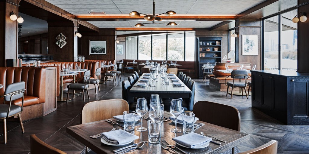
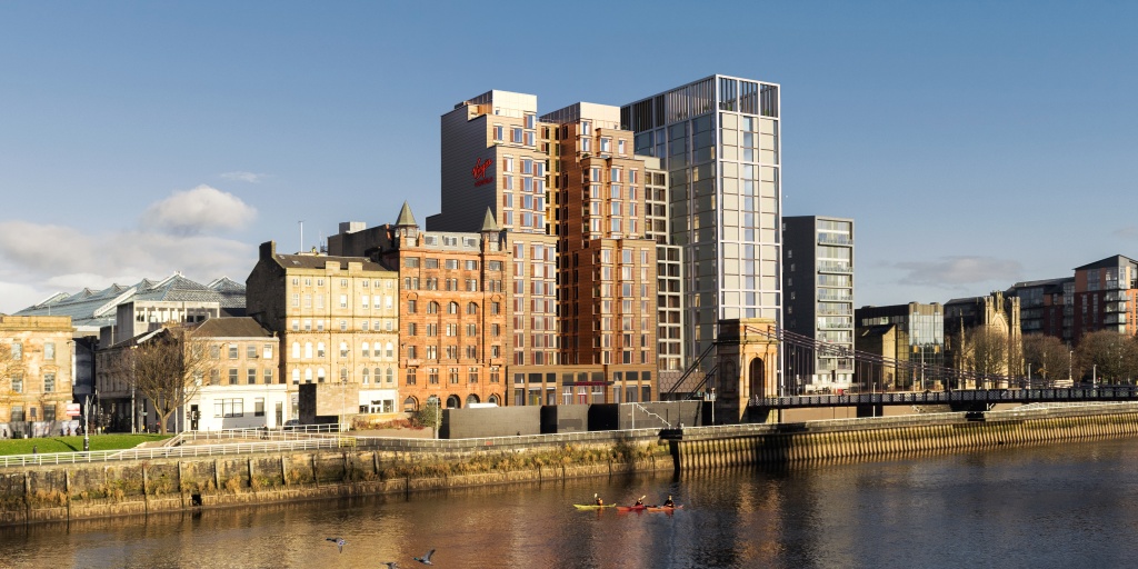
This week’s collaboration with TOPHOTELDESIGN shines a light on five hotels making the most of the colour green.
Standout hotel designs take us from a historic site in rural Italy to urban retreats in Amsterdam and West Hollywood.
Organic inspiration
Colour psychology starts with our most primitive instincts. Even if new meanings are applied through the power of social construct, its core associations go back to our beginnings as a species.
What about green then? What primitive instincts are identified with it? Chances are nature comes up first. Because of that relation to nature, green can provide the serenity that actual greenery conveys. It’s been proven over and over again that green fights stress better than any other hue. And that’s not just because plants are a pleasure to be around.
Green vegetation equals fruitful soil and an abundance of water. For hunter-gatherers that meant food and shelter. Later on, it signified good soil for agricultural sedentism, therefore giving a sense of security and good health. This ancestral instinct has a calming effect on people.
Today we have selected five beautiful projects that used this colour in exemplary ways, integrating interiors that extend organic greenery into the chosen colours of the room and connecting to landscapes with their green tones.
Search for GREEN and explore the results in TOPHOTELDESIGN.
The Upper House

Moss Hotel
Hobart, Australia
by Circa Morris-Nunn Architects
Hyatt Regency Amsterdam
Amsterdam, Netherlands
by concrete
Supplied by KAMPER Handwerk+Bau GmbH, Hansgrohe & Andy Mannhart AG
The West Hollywood EDITION
West Hollywood, United States of America
by Ian Schrager Company & John Pawson
Supplied by Hansgrohe & KALDEWEI
Monsieur George
Paris, France
by Anouska Hempel Design
Supplied by ASCOLIA N.V.
Image by © Gaelle Le Boulicaut
Related Articles
[showlayout id=510774]
Error, group does not exist! Check your syntax! (ID: 3)


