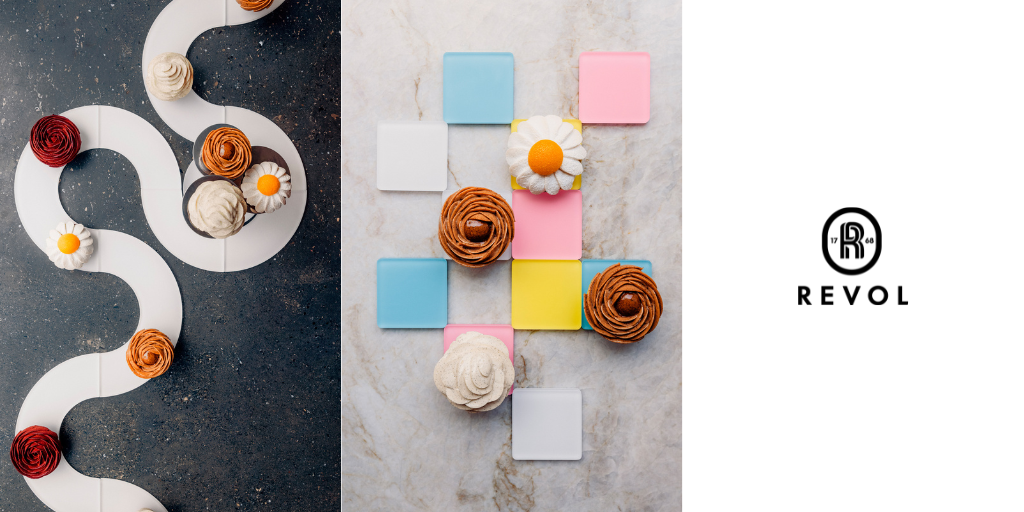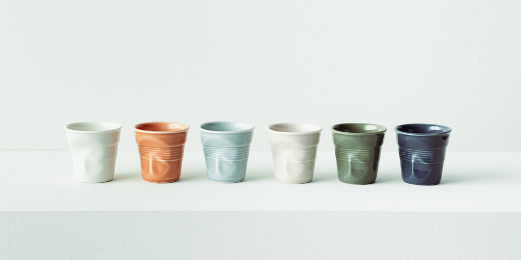

Revol is releasing a collaboration with Ressource that gave a harmonious range to translate nature elements into colours, playing with shades and nuances on the Froissés cups.
These passionate French companies are both family-owned businesses located in the South of France, awarded with the EPV heritage label for their know-how and history.
Ressource is a creative and independent manufacturer with a rich palette over 1000 colours. This project is an opportunity for interesting colours to bring out the unique shape of the Froissés.
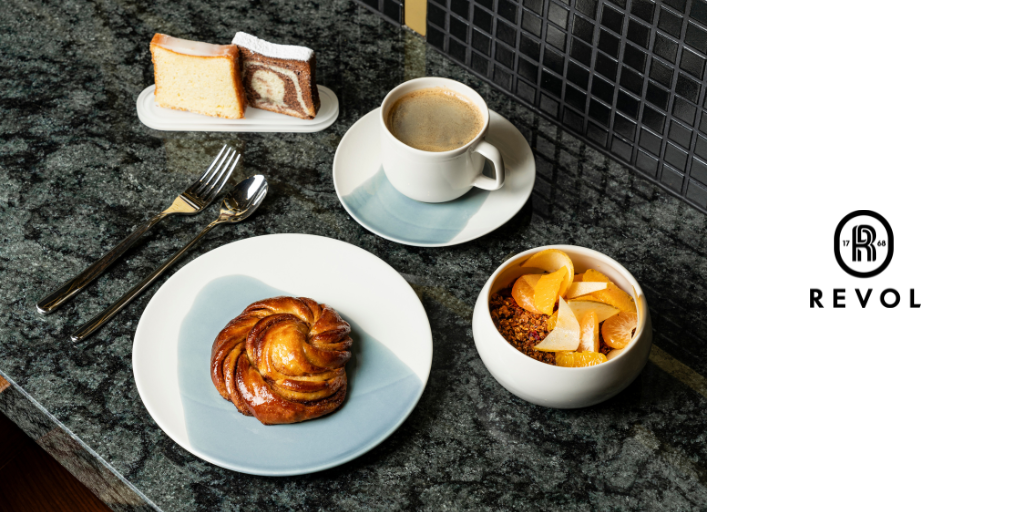
This range was conceived in response to different tastes and decorative styles. Whether on a kitchen counter, on a tablecloth in a restaurant, on a fireside coffee table, on the edge of a desk … it has been thought out to allow for all sorts of possibilities, with a balanced range with warm, cool, light, strong, sober, and bright colours.
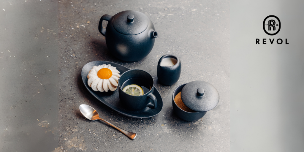
These colours have their own history to share:
Green Garrigue: A khaki with a hint of bronze, quite strong without being too dark. A compelling colour rooted in the nature of the South of France where plants are bathed in sunshine and exposed to the wind. A sophisticated, chic colour for strong decor.
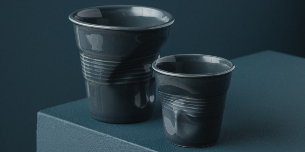
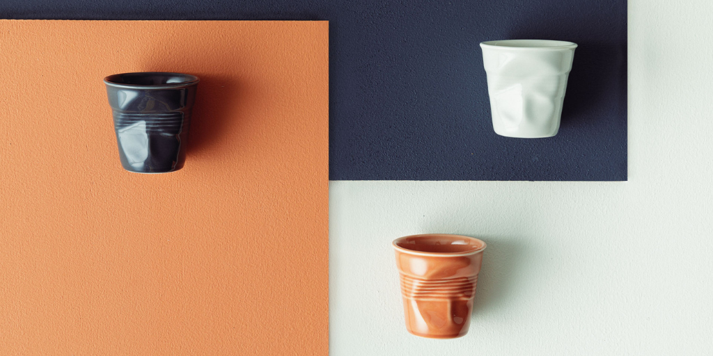
Graphite: A very dark grey bordering on black. A hint of magenta lights its up and enlivens it – this is what stops it being black. Neither grey, nor black, nor blue, it is the very essence of a dark colour that one can’t classify. Reminiscent of intensely matte raw volcanic rocks forged by fire and of slate, it’s a characterful, bold colour, a neutral colour for low-key urban decor.
Blue Mistral: A blue enamoured of green, with a hint of yellow giving it luminosity. It’s inspired by the blue skies of Provence, where the clouds have been swept away by the mistral wind and made way for a pure, intense expanse of blue. An accessible colour suited to luminous, gentle, contemporary decor.
Grey Pebble: A light, neutral, warm beige enlivened by pink, yellow and brown for an icing-sugar hue. This colour puts one in mind of the pebbles of the Rhône Valley but also of walking barefoot on the beach. It’s a colour both classic and contemporary for low-key, discreetly elegant décor.
Shell white: A nuanced white with a very subtle hint of yellow and brown to bring it a touch of warmth. It goes well with the other colours, its small concentration of pigments linking it naturally to the rest of the range. Neutral and low-key, its elegance makes it at home anywhere and in all types of interiors.
Sienna Earth: A warm colour inspired by the ochres of Provence, this soft, slightly earthy orange reminds us of Provençal culture with its Italian inspiration. This bright but delicate hue can both make itself known and blend in, ideal for interiors filled with crafts and natural materials.

This partnership with Ressource is just beginning, so stay tuned because there is more to be revealed!